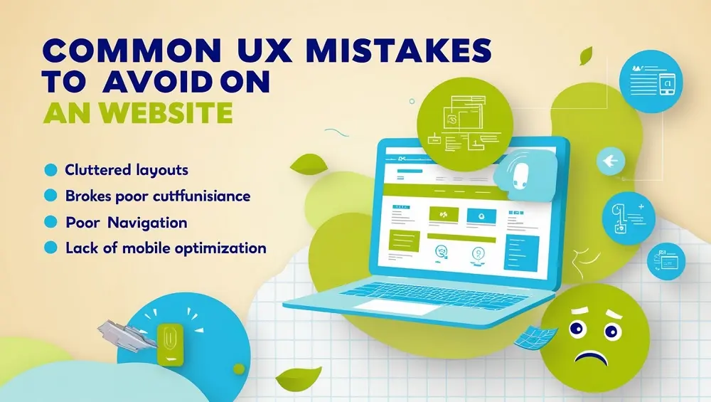
Creating a website that is visually appealing and functional is essential, but it’s equally important to ensure that your site provides a seamless user experience (UX). Poor UX can frustrate users, drive them away, and negatively impact your business. Here are common UX mistakes to avoid, along with examples and suggestions for improvement:
1. Slow Page Load Times
Why It’s a Problem:
Users expect websites to load quickly. According to studies, a delay of even one second can reduce conversions by up to 7%.
Example:
Imagine visiting an online store, and the product pages take 10 seconds to load. Frustrated, you leave the site and shop elsewhere.
Solution:
- Optimize images and videos for the web.
- Use caching and Content Delivery Networks (CDNs).
- Minimize JavaScript and CSS files.
2. Poor Navigation Structure
Why It’s a Problem:
If users cannot easily find what they’re looking for, they’re likely to leave your site. Confusing menus or an overcomplicated layout create frustration.
Example:
A blog with a navigation bar that hides categories under multiple dropdowns makes it hard for users to find relevant articles.
Solution:
- Use a clear and consistent navigation menu.
- Implement breadcrumb trails for better orientation.
- Test navigation with real users to identify pain points.
3. Not Mobile-Friendly
Why It’s a Problem:
With mobile devices accounting for over half of global web traffic, a non-responsive design alienates a significant portion of your audience.
Example:
A restaurant’s website that’s difficult to read or interact with on a smartphone will deter potential customers.
Solution:
- Use responsive design frameworks like Bootstrap.
- Test your site on various screen sizes.
- Ensure clickable elements are large enough and spaced appropriately for touch interactions.
4. Too Much Text or Cluttered Pages
Why It’s a Problem:
Overwhelming users with too much information can make them lose interest or miss key details.
Example:
An e-commerce site with excessive text, irrelevant images, and banners distracts users from finding products they want to buy.
Solution:
- Use whitespace effectively to improve readability.
- Break text into short paragraphs and use bullet points.
- Focus on clean, minimalist design.
5. Lack of Clear Call-to-Actions (CTAs)
Why It’s a Problem:
If users don’t know what to do next, they’re unlikely to convert. Ambiguous or hidden CTAs can lead to confusion.
Example:
A subscription-based website with a tiny, non-descriptive “Learn More” button instead of a clear “Subscribe Now” button.
Solution:
- Use actionable language, e.g., “Get Started,” “Sign Up,” or “Buy Now.”
- Place CTAs prominently and consistently.
- Use contrasting colors to make them stand out.
6. Ignoring Accessibility
Why It’s a Problem:
Websites that aren’t accessible exclude users with disabilities, which can lead to lost opportunities and potential legal issues.
Example:
A site with poor color contrast and no screen reader support alienates users with visual impairments.
Solution:
- Follow Web Content Accessibility Guidelines (WCAG).
- Include alt text for images and captions for videos.
- Ensure keyboard navigation works throughout the site.
7. Intrusive Pop-Ups
Why It’s a Problem:
Pop-ups that appear immediately or cover the entire screen can irritate users, especially on mobile devices.
Example:
A blog that immediately shows a pop-up asking for an email subscription before users even read the content.
Solution:
- Use pop-ups sparingly and strategically.
- Allow users to close pop-ups easily.
- Delay pop-ups until the user has interacted with the site.
8. Broken Links or Errors
Why It’s a Problem:
Nothing frustrates users more than clicking on a link only to encounter a 404 error or a broken page.
Example:
A product page on an e-commerce site that leads to a “Page Not Found” error.
Solution:
- Regularly test and update links.
- Use tools to monitor broken links.
- Create a helpful 404 error page with navigation options.
9. Autoplay Videos and Audio
Why It’s a Problem:
Unexpected sounds or videos can startle users and cause them to leave the site quickly.
Example:
A news website that plays a video automatically as soon as the homepage loads.
Solution:
- Avoid autoplay for media content.
- Provide clear controls for play, pause, and volume.
- Offer text alternatives for videos.
10. Overuse of Animation and Effects
Why It’s a Problem:
Too many animations can slow down your site and distract users from the main content.
Example:
A portfolio website with excessive hover effects and animations that make navigation cumbersome.
Solution:
- Use animations sparingly and purposefully.
- Prioritize performance when implementing effects.
- Test the impact of animations on user flow.
Conclusion
Avoiding these common UX mistakes can significantly enhance your website’s usability and user satisfaction. Always prioritize your audience’s needs, conduct usability tests, and continuously iterate based on feedback. A user-centric approach ensures a website that’s not only functional but also enjoyable to interact with.